In the fast-moving world of web design, websites –and the designers, developers and brands that build them –are constantly tracking the latest popular trends and technologies. Whether you’re talking about a sleek one-page parallax design or incorporating chatbots, competition to attract and engage visitors is fierce. Why is it then that so many sites neglect one fundamental requirement –making sure their website is accessible to everyone.
What is Web Accessibility?
Web accessibility is a term that refers to the principles of designing and developing websites, web tools, technologies and online content that allow all individuals, regardless of disability, to use and interact with them easily. Web accessibility should seek to provide inclusion regardless of the nature or severity of an individual’s impairment whether it be auditory, neurological, cognitive, visual, physical or speech. In addition, web accessibility measures are also useful for web visitors who may not have disabilities but have situational limitations instead. That could include someone with a temporary disability like a broken arm, someone with slow or limited bandwidth or even someone in a crowded environment unable to listen to audio content.
Why is Web Accessibility important?
As the web becomes more and more ubiquitous in our everyday lives, the importance of providing equal access for all becomes more and more evident. On top of that, attracting and engaging new and growing audiences is a top priority for almost every website out there. So it naturally follows that applying the principles of web accessibility to make your website attractive and useful for a broader audience can extend your reach and enhance your brand. And many basic web accessibility practices can help to boost your site’s SEO performance as well.
How can I make my site more accessible?
Designing and building a fully accessible website from scratch may seem like a daunting task. The good news is that there are some simple changes that you can make to take the first steps towards a more accessible website right now.
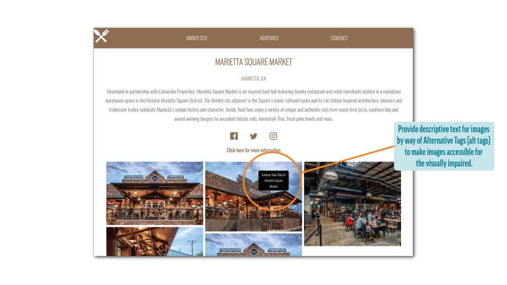
•Make sure your images have alternative text (also known as “alt text”or “alt tags”). Alt text is used by screen readers to help users understand an image and will also be displayed in cases where an image file cannot be loaded. Alt text also provides important indexing information to search engine crawlers, which will in turn help your website rank higher in search engines like Google and Bing.
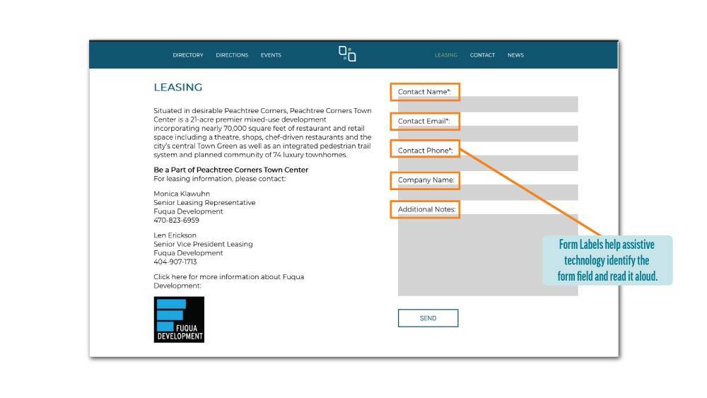
•Make sure to include descriptive labels on your contact form fields.This helps ensure that all users can read and understand how to interact with forms on your site. It’s also important to note that placeholder text inside the field itself is not a good substitute.
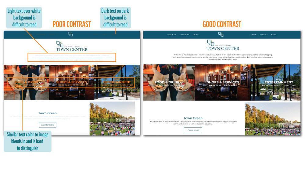
•Think high contrast. While beautiful designs and imagery are important (trust us –we love them), if your website can’t be clearly, easily read then your message is lost. Maintaining a strong contrast between site background and foreground text can help to ensure that your information is readable as well as attractive.
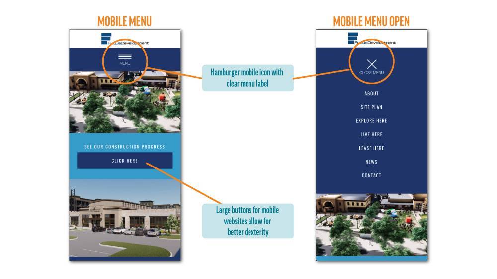
•Mind your menu. Mobile-style collapsed menus, often called “hamburger menus”, are now widely used on many sites. Make sure that your hamburger menu includes readable text along with the icon that indicates what it is and what it does.
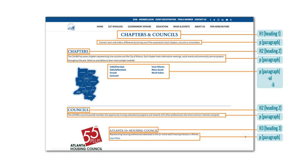
•Format your headings. Proper use and hierarchy of headings (h1, h2, etc.) in your site’s code helps screen readers and assistive technology understand and locate the most important information on a page.
While web accessibility is an important consideration for providing inclusive website access for users with disabilities or situational limitations, these basic principles can benefit everyone by making websites easier to navigate and use.
Not sure if your website fits the accessibility bill or ready to design a new site with accessibility in mind? We can help! Connect with the Clementine team today to get started.
