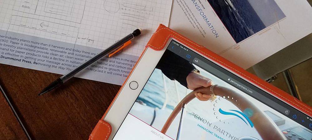
Your website is often the first and sometimes the only place people go to find out about your brand. So, it’s never been more critical to have a website that really works. Websites that really work achieve that perfect blend of seamless functionality and visual storytelling as the backdrop for great content – a compelling trifecta to carry your unique voice forward in the digital world. There are plenty of templated, mass-produced sites out there that meet the functionality requirement. But what about the story, your story, the heart of your brand? That’s where a custom website design – one that blends technical expertise with a powerful creative vision – can make your site and your brand stand above the rest. Read on for a behind the scenes look at how creative design can be the difference between a site that sits and one that sails.
Begin with the Brand
Branding 101 tells us that every touchpoint with your audience should reinforce the core of your brand with a cohesively crafted look, voice and experience. Nowhere is this more important than at your digital front door. Branding your website means more than just picking a background and adding your logo to the top of the page. It means telling your unique brand story through every element beginning with the visual design which will give visitors their first, fast impression of you and what you’re about even before they read a word.
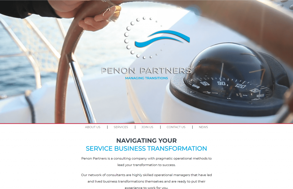
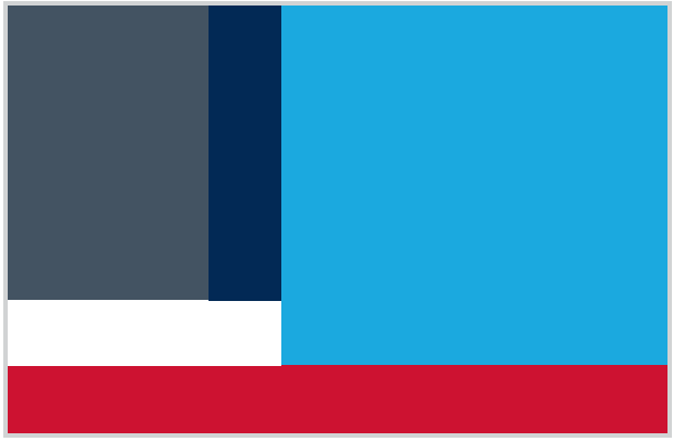
When we set out to create a custom website design for IOT consulting firm Penon Partners, we started with who they are. Founded in Paris, Penon Partners draws its name from the French term “penon” referring to the small banners or flags used on sailboats to indicate the direction of the wind. Building on this core idea of helping their clients navigate their business transformations, the brand identity mixes the penon iconography with sleek tech-inspired elements reflecting their expertise, all in a modern, nautical color palette.
All of this is reflected in the individual creative decisions made for their website. A branded video element is pulled to the top of the page to allow their story to take center stage. Imagery throughout the site maintains the navigational theme. Color choices are streamlined and tuned specifically to the brand’s palette. All of these are subtle touches that tune visitors into the core of Penon’s identity and message with only a glance.

Craft an Experience
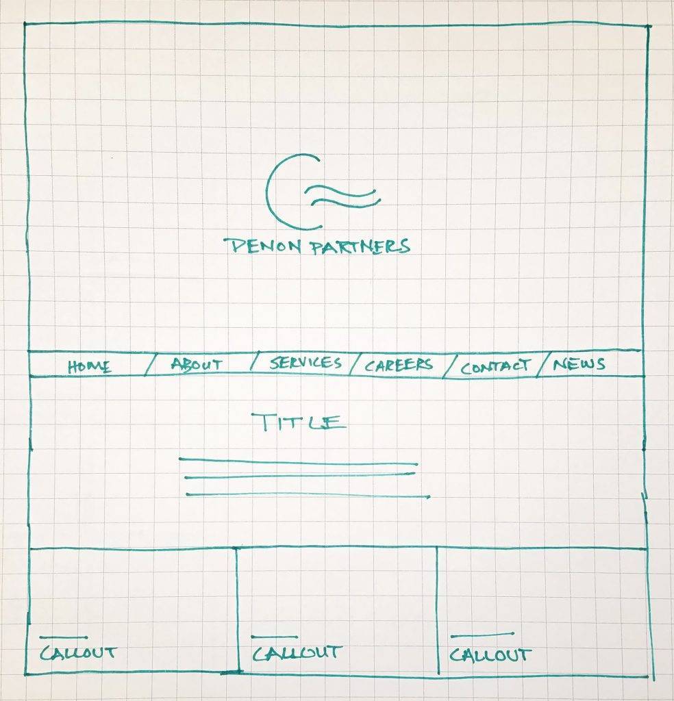
Visual storytelling doesn’t just serve to reflect and celebrate the brand. It also serves a functional purpose in pulling visitors easily and intuitively through the written content of the site. In the case of Penon Partners, a critical challenge was to convey complex business systems and processes in a way that was clear, engaging and ultimately actionable. This effort begins in the visual design and architecture of the site itself. Large graphic icons guide visitors deeper into the Penon experience. Intentionally magnified padding on both sides of page content creates plenty of white space to allow the content to breathe and read more comfortably.
On a page dedicated to services, the details of their program structuring meant lots of content to handle – but content that is critical to their potential clients. In order to include it all, you could simply keep building down the page with continuous scroll. But just because the page can scroll forever doesn’t mean it should. In order to avoid the risk of losing visitors to fatigue before they find the content that’s relevant to their needs, a series of graphic call-outs were crafted for the top of the page to break down the content by categories. These graphics animate on hover and on click through reveal the targeted content at top of page. This combination of visually attractive iconography with multi-functional content areas allows visitors to interact, engage and drill down to the content they want to see rather than simply scroll the page.
Think Design Forward
Too often, web design and web content strategy run on two parallel tracks until they inevitably collide at build time. However when approached hand in hand, design and content can boost each other to new heights. It’s this comprehensive ability to develop a thoughtful, well-integrated strategy for presenting a brand that makes custom web designs so powerful.
In essence, great design paves the way for great content. By capturing visitors on a first look, leveraging visual storytelling to drive the user experience and helping to make content shine, a custom website design can convey your authentic voice and answer your audience’s unique needs – and that can be a game changer when it comes to brand awareness, engagement and conversion on the web.
Visit penonpartners.com to see the partnership between design and content at work.


